In 2025, the digital world is more mobile than ever. From smartphones and tablets to smart TVs and wearable screens, people access the web on devices of all sizes. In this landscape, responsive design isn’t just a feature—it’s a necessity.
What Is Responsive Design?
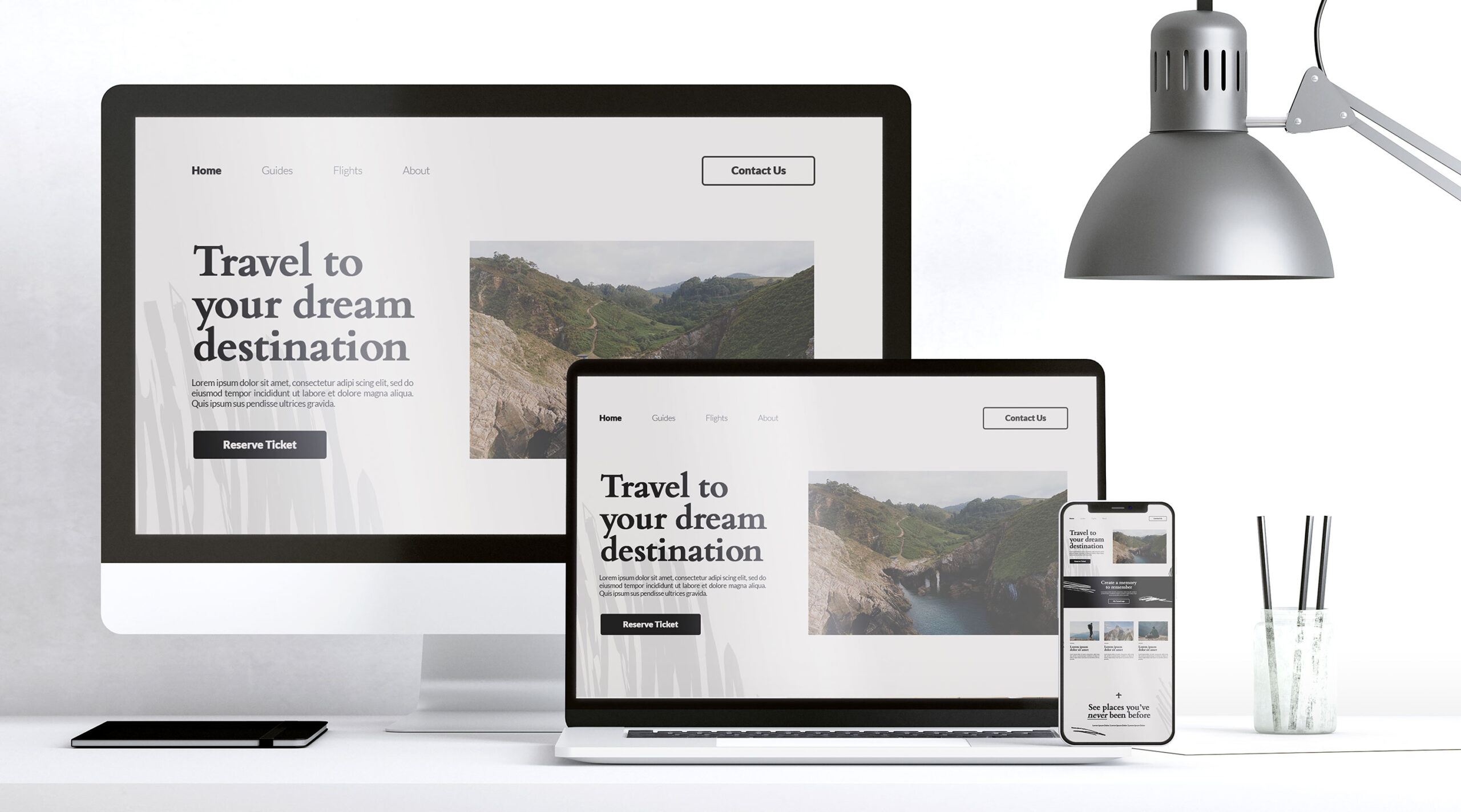
Responsive design is a web design approach that makes your website adapt to different screen sizes and devices. Instead of building separate websites for desktop and mobile, responsive design uses flexible layouts, media queries, and fluid images to ensure content looks great everywhere.
In simple terms, a responsive website rearranges itself automatically to fit the screen it’s viewed on—whether it’s a 6-inch smartphone or a 27-inch desktop monitor.
Why It Matters More Than Ever in 2025
1. Mobile-First Usage
Over 70% of web traffic now comes from mobile devices. A site that isn’t mobile-friendly in 2025 is a site that’s losing visitors.
2. Google Ranking
Google uses mobile-first indexing, meaning it primarily evaluates the mobile version of your site for ranking. A non-responsive design can hurt your visibility on search engines.
3. User Experience
A responsive site improves navigation, reduces bounce rates, and keeps visitors engaged. No one wants to pinch-zoom or scroll sideways in 2025.
Cost and Time Efficiency
Instead of maintaining separate versions of a site for each device, responsive design streamlines your workflow. It saves development time and maintenance costs.
Better Conversion Rates
A site that works perfectly on every screen builds trust. Whether it’s a blog, portfolio, or e-commerce platform, responsive design helps convert visitors into followers or customers.
Real-Life Example
Imagine a photography blog with rich visuals. On a non-responsive site, images may overflow the screen or break layout. On a responsive site, those same images scale beautifully across mobile and desktop—keeping both form and function intact.
If you’re using WordPress for web designing, responsiveness is no longer something to worry about. WordPress makes it easy to preview your website on mobile, tablet, and desktop views during the design process itself. With page builders like Elementor, you get built-in options to fine-tune layouts for each device, ensuring a smooth and professional look across all screen sizes. In 2025, responsive design is not just important—it’s effortlessly achievable for anyone working with WordPress.
Image Credit
Image by freepik


